
Side Borders
|
For this lesson, we were instructed to create a side border background with all the components of a webset: header, buttons and bars. My inspiration for this set came from the music that you are listening to. It is an original piano composition titled "Mysterious" by Yuko Ohigashi, which is also the title of her second CD. She is a 16 year old composer who lives in Japan and has been playing the piano since she was 6. I think she is a very talented young woman. Although it is a music box that is incorporated into the work, it reminded me of wind chimes, hence my header graphic.
|
|
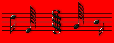
To achieve proper placement of the text and graphics in this lesson, we needed to use a transparent gif, tabled into the background. The transparent gif acts as a spacer to push the text and graphics off the side border. To see an example of this same page without the transparent gif, click HERE. A word of warning, it's not very pretty. I have really enjoyed these lessons. I have learned quite a bit about web design, that I had not known before. Font used for graphics is Melody Maker. |


Web Design Copyright ©by
DaneMist Graphix
Please contact
Webmaster with any questions or problems with this site.
This set is not linkware. This set was designed for a class at Juelle Web Design.